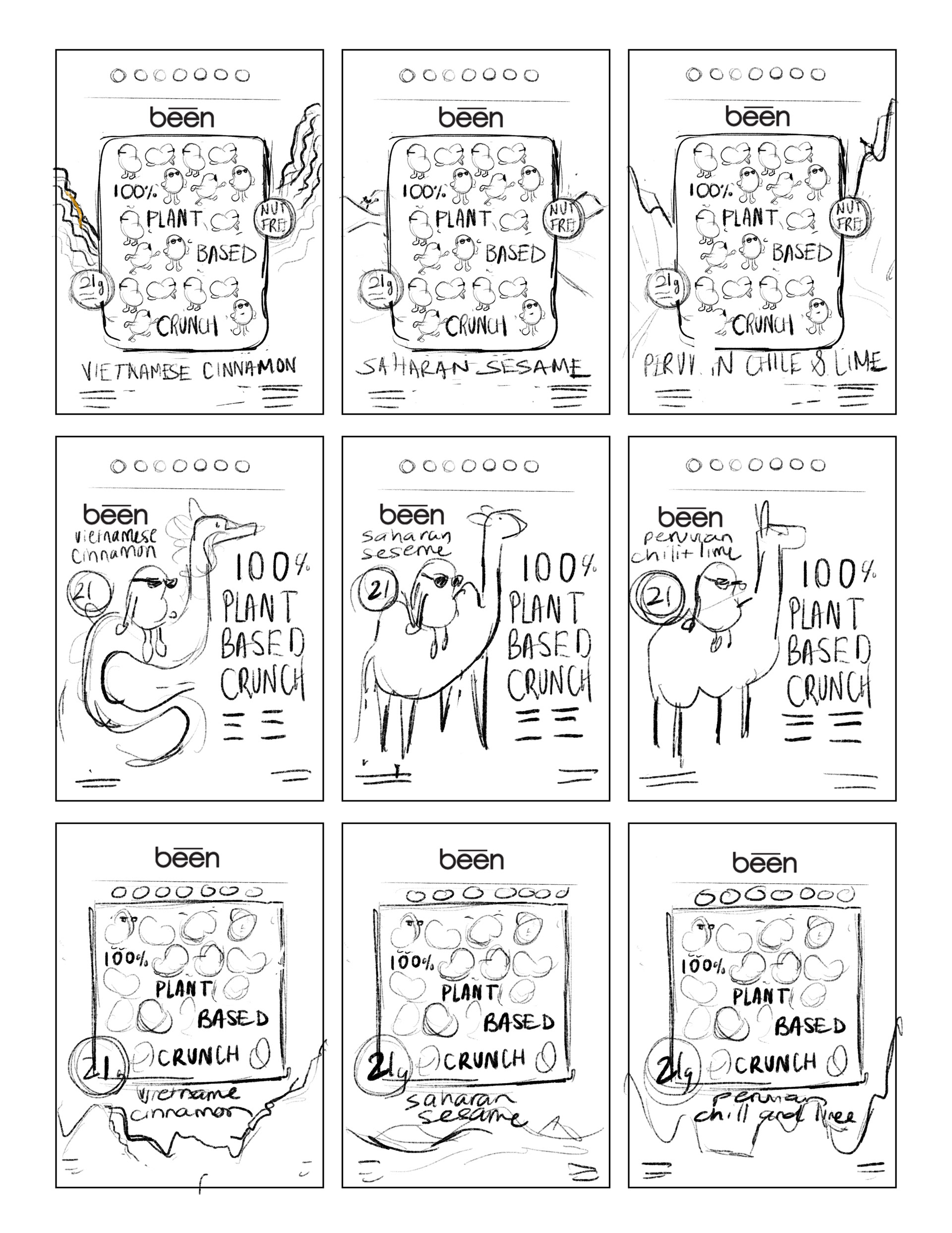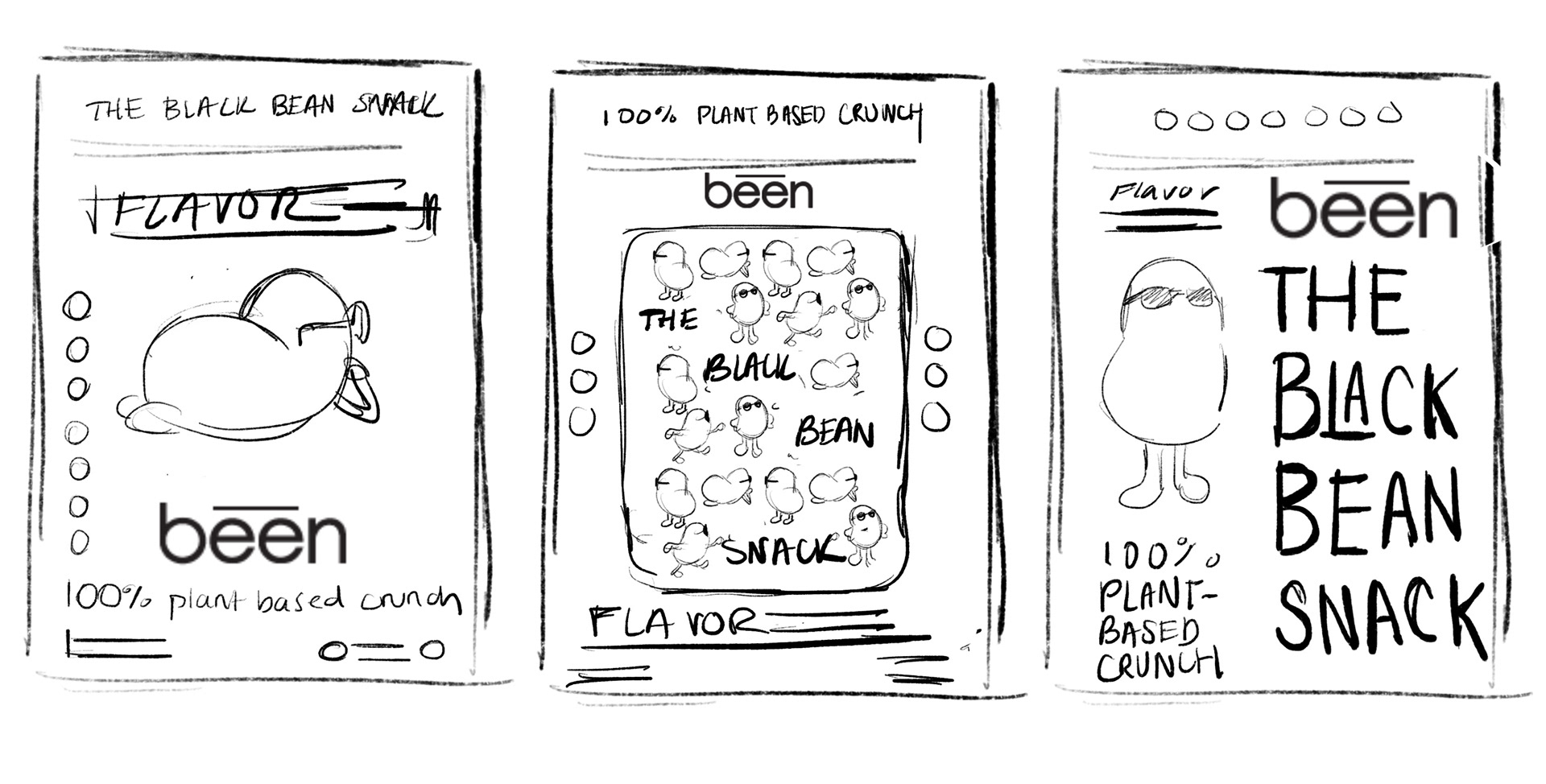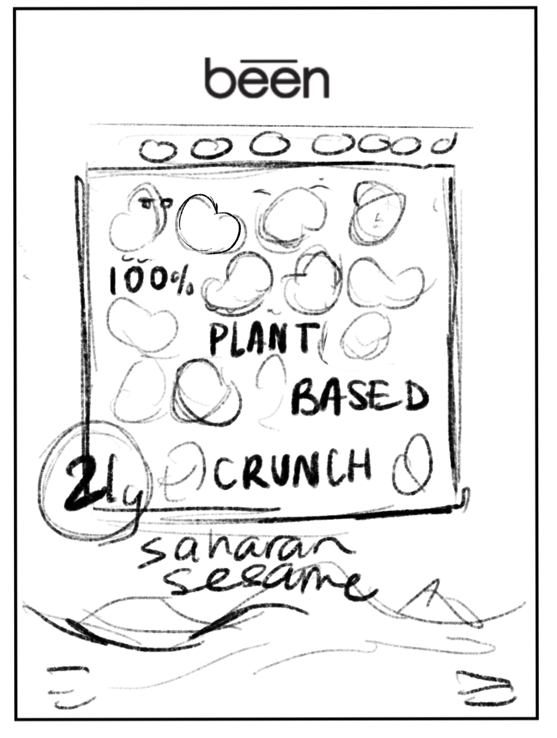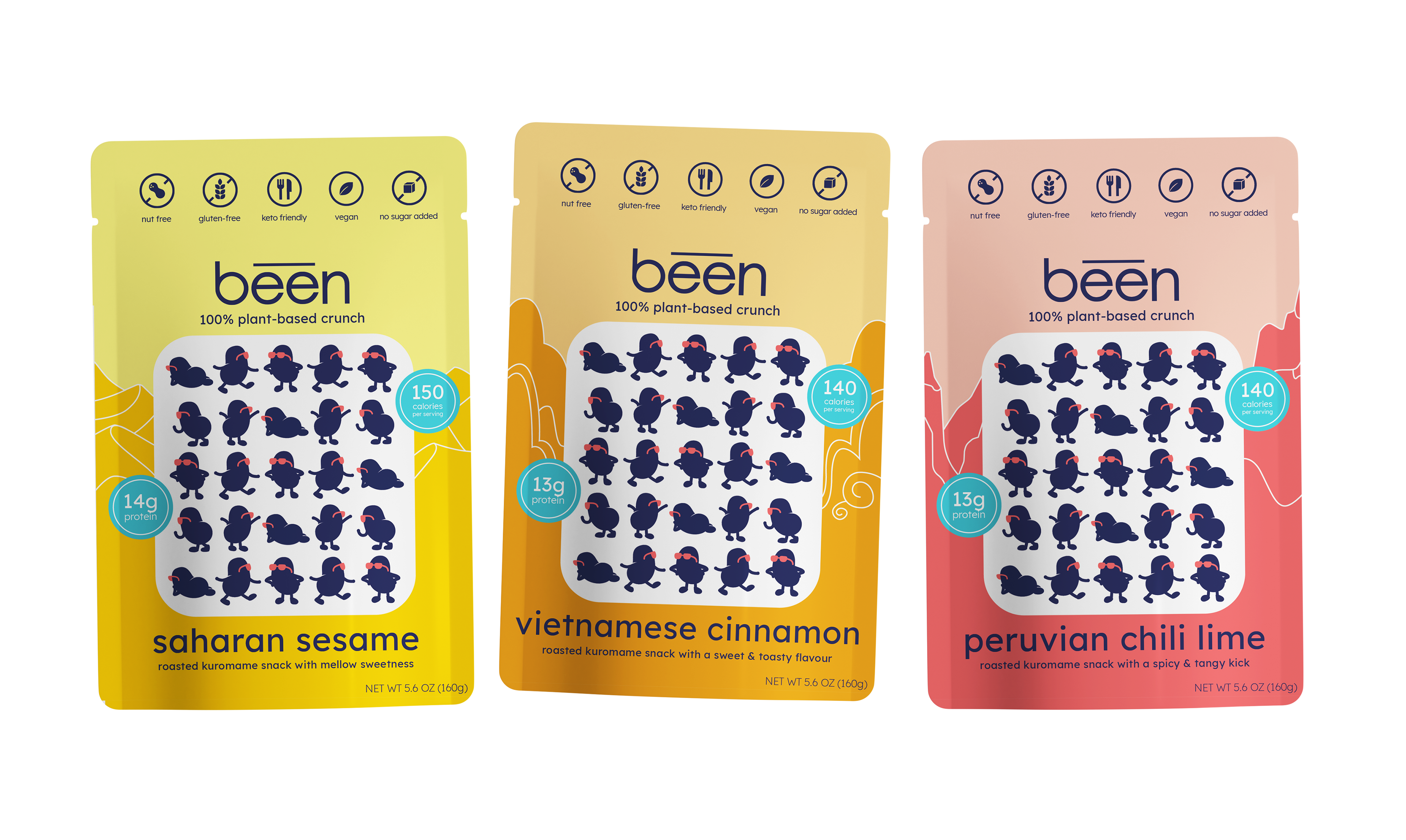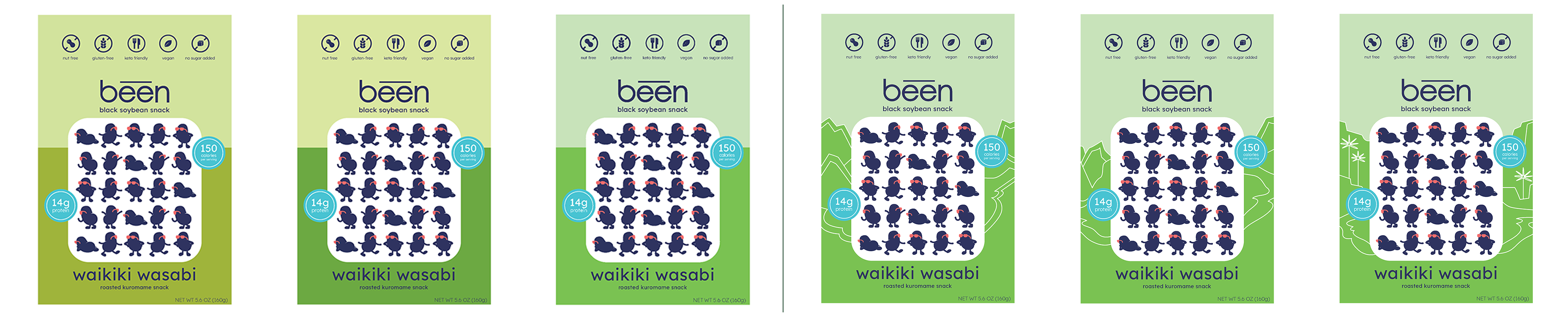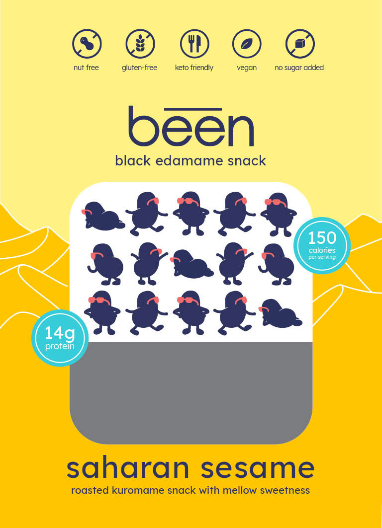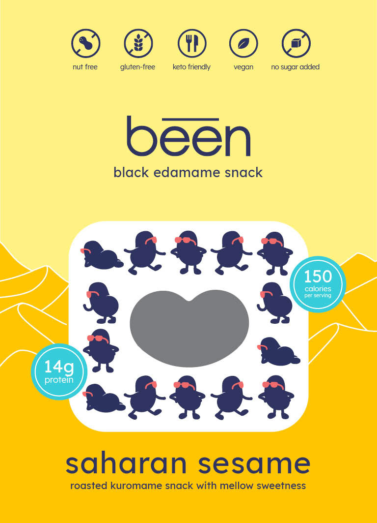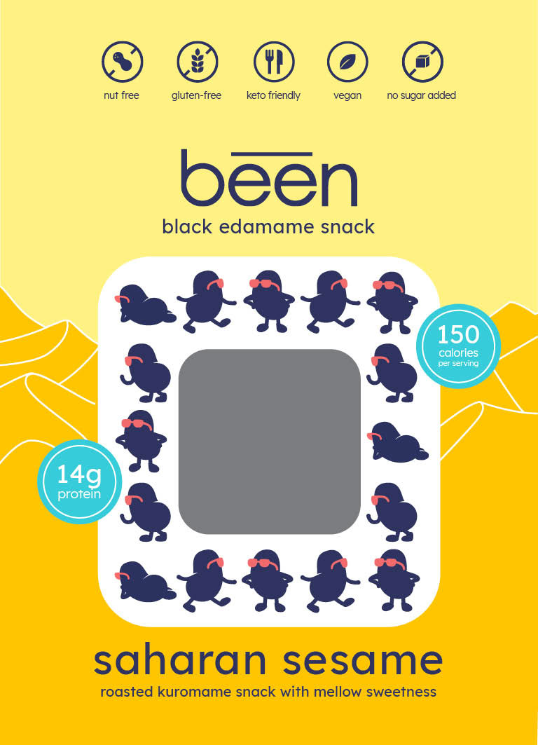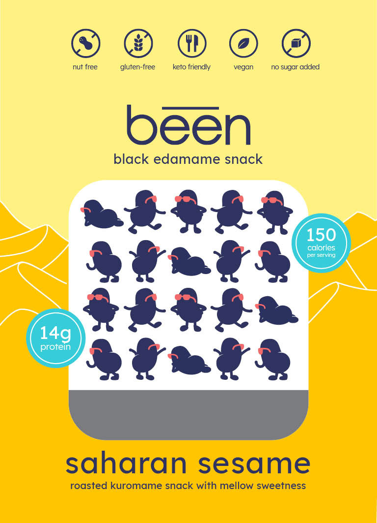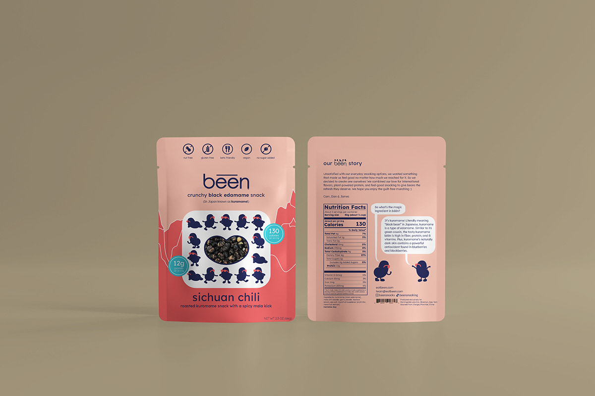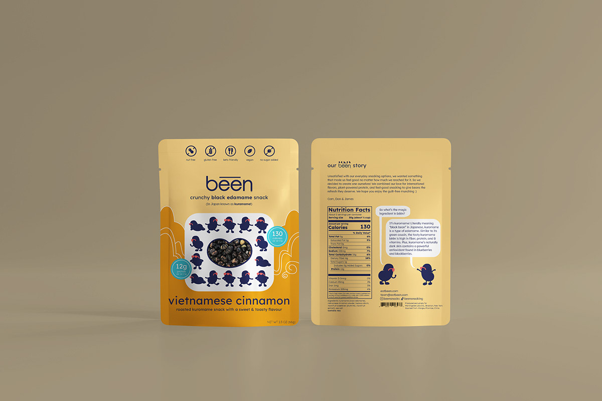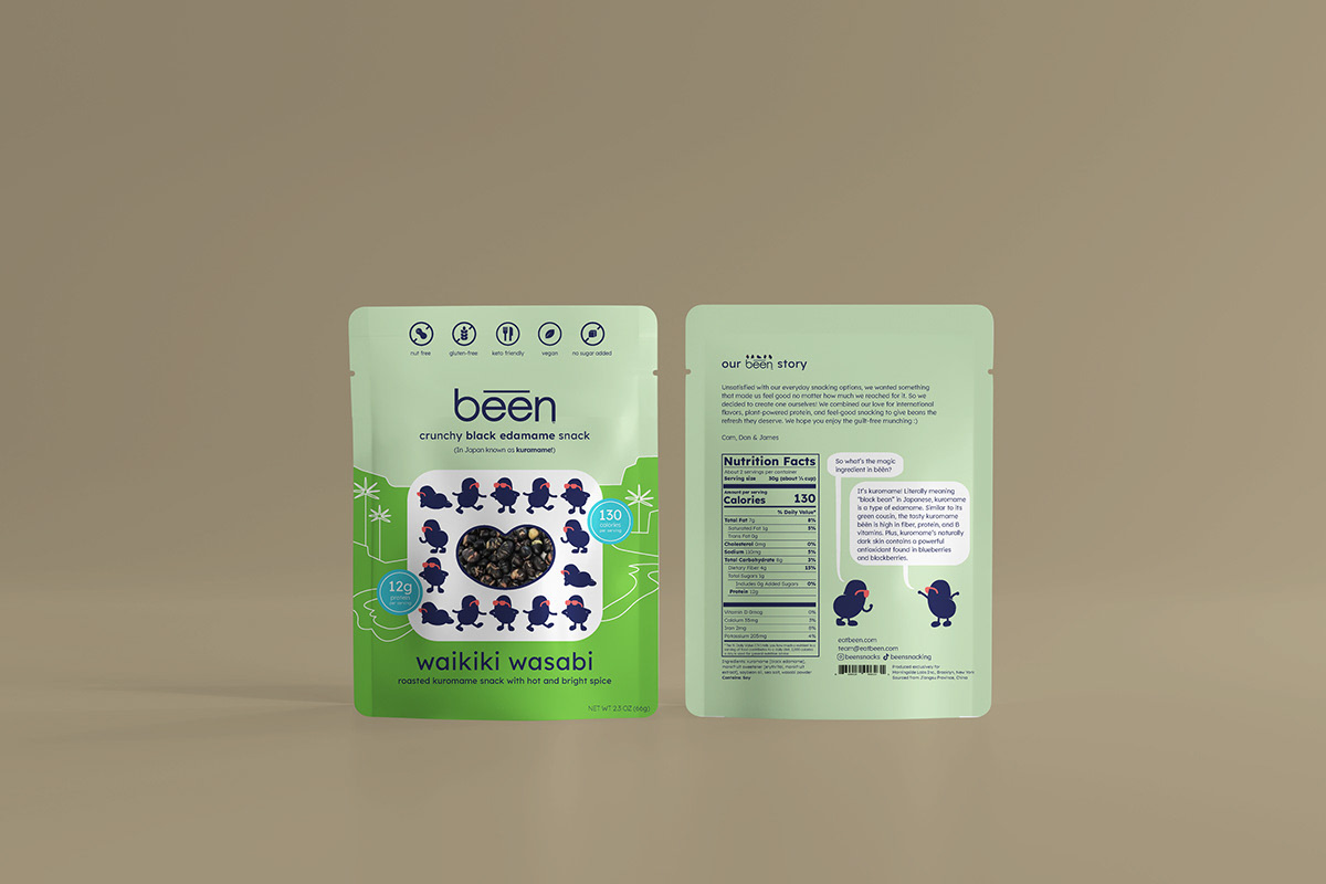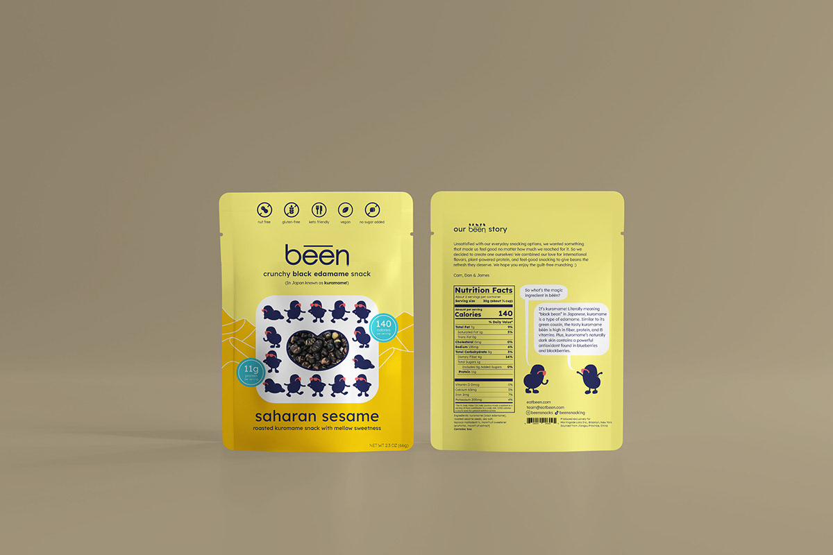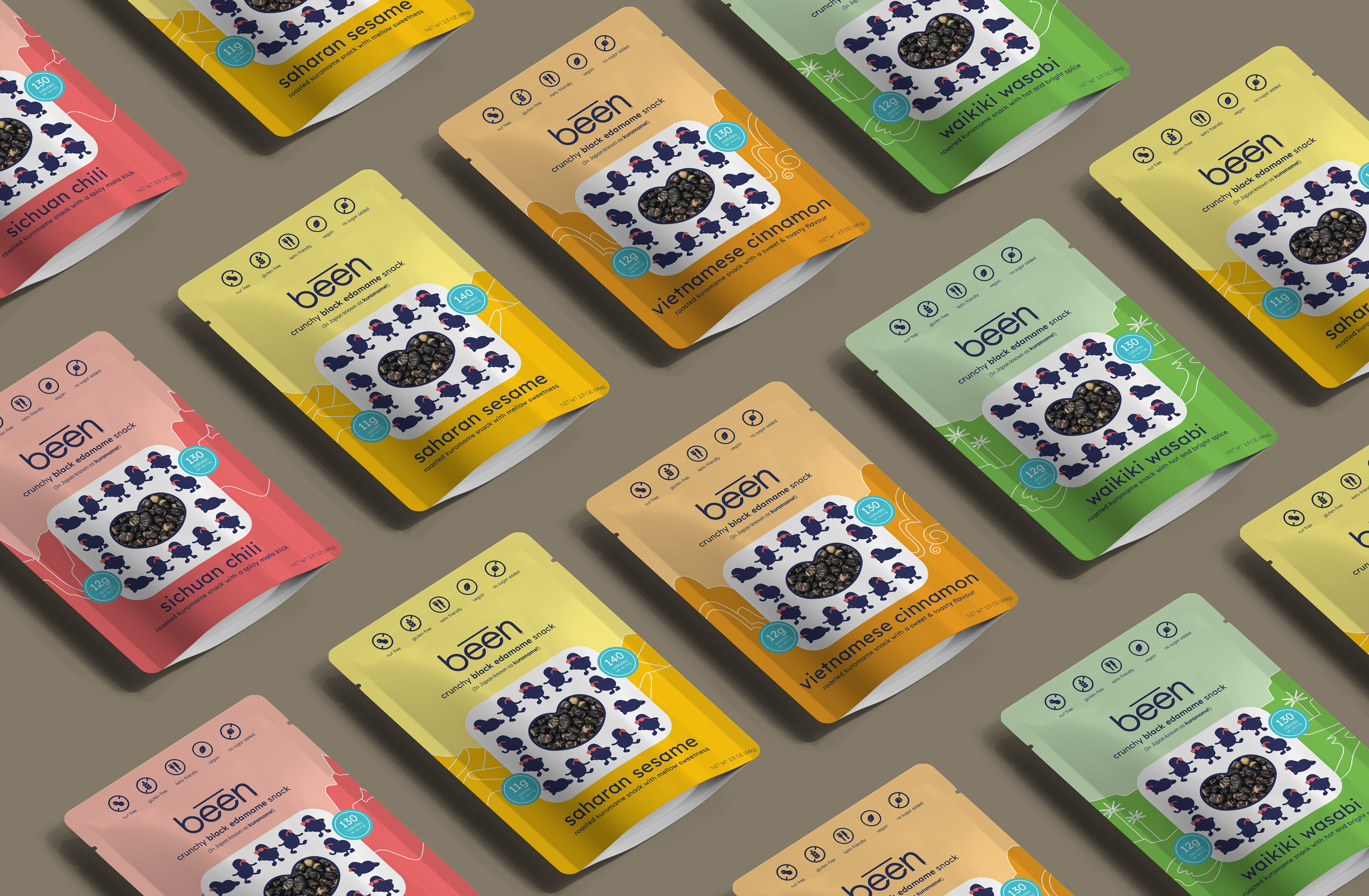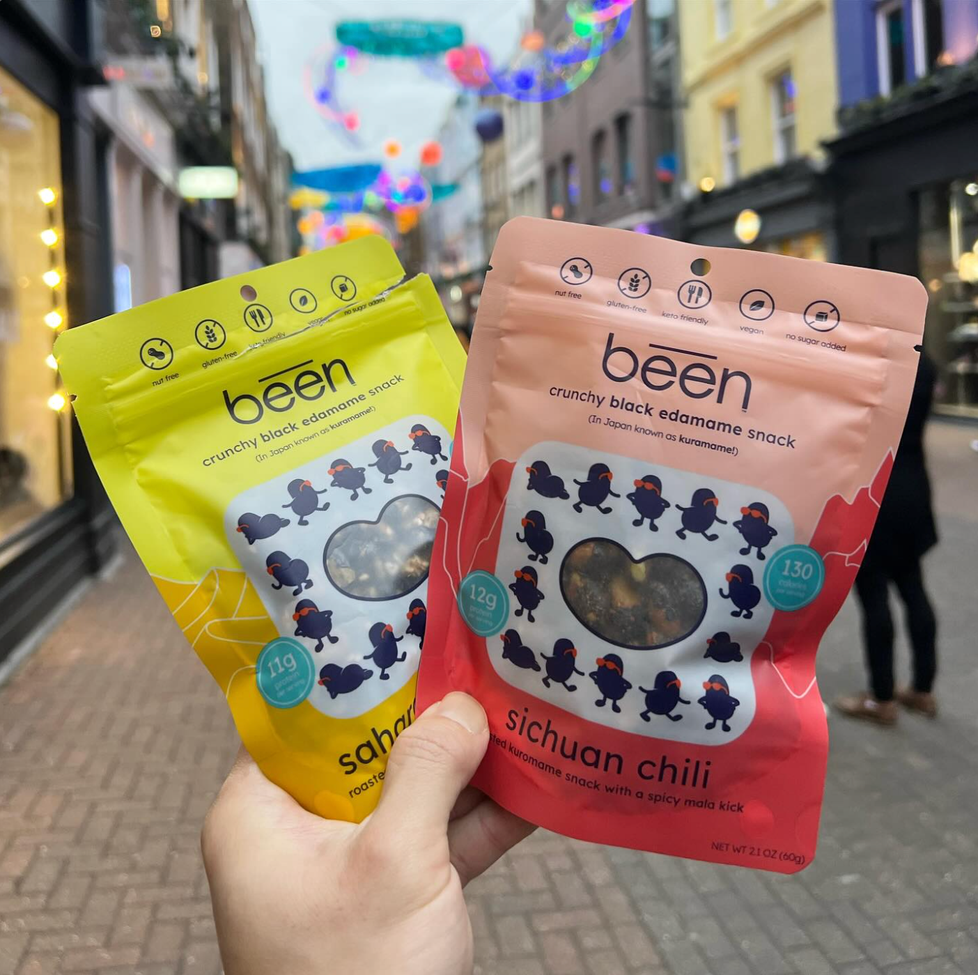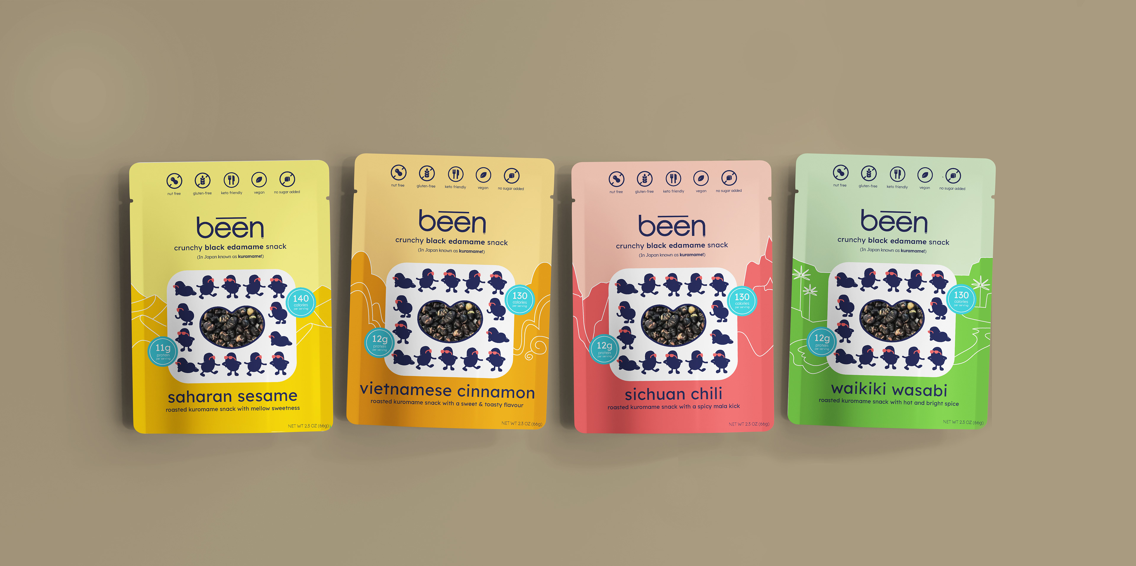
Early in development, the been team highlighted the significance of their mascot, the kuromame, and emphasized how each flavor is tied to a specific region. Early sketches explored how to incorporate regional differences across packaging, and we moved forward with emphasis on diverse mountain ranges that define each geographic location. I also expanded on the kuromame mascot to highlight it's personality and character.